Doing simple layout
You asked me to write about simple typography and layout, so here are my best tips to make a game look more professional.
If you can, you should hire a layout artist, rather than using these tips. I’m not an expert. I’ve learned what I know by working with professionals.
In any case, I hope these rules get you excited about layout and typography.
Use a classic typeface
If there’s one thing that makes a game look professional, it’s a good typeface,1 especially on the cover.
By contrast, I’ve often seen:
Horror games that use a bad “horror” typeface as a heading.
Science fiction games that use a bad “futuristic” typeface as a heading.
Historical games — or those that want to look classy — that use a bad “script” typeface as a heading.
Instead, use a classic typeface. Caslon, Garamond and Bodoni are classic serif typefaces. Geometric typefaces such as Johnston, Futura and Gill Sans are good sans-serif typefaces.2
If you want more, do a search for “classic fonts” or similar. And, if you can’t find those specific typefaces, try searching for a good alternative. For example, for this article, I wanted an alternative to Futura, and I found a few sources online that recommended the Google font “Jost”.
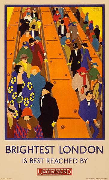
Try choosing a typeface from your game’s time period: if your game is set in the 1920s, search for typefaces commonly used in the 1920s. You might look at books and posters from the time, like this one. It uses a simple geometric typeface, so you could try a classic geometric typeface (e.g. Johnston) to get a similar style.
One word of warning, though: please don’t find fonts by searching for “1920s fonts”, because what you find won’t be good. To see what I mean, search for “1920s fonts”. You’ll get a lot of over-ornamented Art Deco fonts.
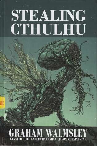
My book Stealing Cthulhu uses Bodoni throughout. I based the style on the oldest book I found in my parents house, which was a prayer book from around 1910.
Page size
There are two common sizes for roleplaying games.
Popular commercial roleplaying games are usually 8.5 inches wide and 11 inches tall. In Europe, the equivalent size is A4. Inside these books, there are often two columns of text. That’s because, at this size, a single line of 10pt or 11pt text is hard to read.
Another common size is 6 inches wide and 9 inches tall, known as “trade size” or “US trade”. In Europe, the equivalent is A5. Inside, you’ll often find only one column of text.
For my books, I usually use the smaller size. This is because my games are often short (e.g. 50,000 words) and, if I used the larger size, the book would look thin. The only time I’ve used the larger size was for Cthulhu Dark, which had over 100,000 words.
Margins and guides
Make your margins a simple fraction (e.g. 1/10, 1/11, 1/12) of the page height or width. For example, try making your top margin 1/12 of the page height, then your inner margin 1/12 of the page width.
Your bottom margin is usually twice your top margin. That is, if your top margin is 1/12 of the page height, your bottom margin is 2/12. Your outer margin can be either the same (e.g. 1/12) or twice (2/12) your inner margin.
To see the difference this makes, print a Word document or Google Doc that’s been created with default margins. Then set the margins as above and print it again. It looks instantly more professional.
You’re likely to need a “gutter”: that is, a small amount added to your inner margin, to compensate for the binding. If you don’t, then when you print your book, it will look weirdly squashed into the centre.
Positioning other things
To position other things, divide your page using simple fractions (e.g. 1/2, 1/3, 1/6), then use these to guide your positioning.3
If you’re positioning text, put the baseline or the top of the text at that position.
You can also position things using the golden ratio. Try dividing your page with a guide 38% or 62% of the way down the page.4 If that doesn’t look right, try dividing it again.
This diagram shows what I mean. On the left, I’ve divided the page with a guide, 38% of the way down. Then I divided the bottom section with another guide, 62% of the way down. On the right, I used those guides to position the text.
Sizing and spacing
For your text, try using 10, 11 or 12 point text.5 If it’s smaller, it gets hard to read. If it’s larger, it looks weirdly big.
Set your paragraph spacing to a fraction or multiple of that number. For example, if you’re using 10pt text, try 5pt or 10pt spacing between paragraphs. This gives a clean and organised look.
You can use “leading” to keep similar spacing (e.g. multiples of 5pt or 10pt) for your headings. For example, if you’re using a 24pt heading, try setting the leading to 25pt, to keep those multiples of 5pt.6
Finally
I’ve kept this simple, which means I’ve missed out lots of important things. If you think I’ve missed something vital, tell me!
Thanks to Brennen Reece, who taught me lots about layout and got me excited about it. I learned lots of the tricks above from him.
I hope you enjoy typography and layout. If you want more, the classic text is Robert Bringhurst’s The Elements of Typographic Style, which is beautifully readable.
If you’re wondering about the difference between typefaces and fonts: Garamond is a typeface, 12-point italic Garamond is a font.
Avoid Gill Sans itself, because Eric Gill was a nasty character, but there are lots of good alternatives (e.g. Johnston and the range of typefaces used for transport).
If you prefer a non-mathematical solution, divide the page into a grid. The top margin takes one row of the grid, the inner margin takes one column (plus a gutter), the bottom margin takes two rows and the outer margin takes one or two depending on taste.
The golden ratio is about 1.618 and the inverse is 1/1.618 = 0.618. That’s where 62% comes from. Then 100-62%= 38% is simply 100% minus 62%. What you’re doing here is playing with those numbers.
Jason Morningstar tells me that x-height matters more than the size itself.
This is about the baseline grid, which I won’t explain, but have a look online.


This is truly amazing advice given for free as opposed to being learnt over a period of time and mixed results. You are generous in making this available and these are gems.
Gems for free...
Really helpful and informative read thank you ! Only yesterday I fell into the trap of searching for 1950s fonts and - as you so rightly predicted - found pages of junk. Taking your suggestion of looking at real fonts I stumbled over the realisation that there are apps out there (Find my Font is one) that allow you to scan an image and provide suggestions on what font it might be - so using that with my Quatermass script Penguin book cover really helped me move forward quite a bit. Thank you !!!